
A logo is a business asset when it does a job: it signals trust, communicates where a company sits in its market, and makes the business recognizable everywhere it shows up. A logo chosen because the colors and fonts looked good together is decoration. The difference shows up in how fast customers understand you, and in how often you end up paying to redesign it.
A strong logo isn’t created by picking colors and type that look good together. It’s built to communicate trust, positioning, and recognition long before a customer reads a single word about the business.
What Makes a Logo a Business Asset?
An asset produces value over time. A logo earns that label when it keeps working as the company grows: on a website, a truck wrap, a proposal cover, a social profile, a business card handed across a table.
Four qualities separate an asset from a decoration:
- It expresses a strategy. The mark reflects how the business wants to be perceived and who it’s for. A firm selling premium, selective service shouldn’t look like a discount option.
- It’s recognizable at a glance. Simple forms are remembered. Complex ones blur together at small sizes and on busy screens.
- It scales. The logo works as a full lockup, as a stacked version, as an icon in a 32-pixel app tile, and in one color on a printed invoice.
- It holds up over time. It isn’t built on this year’s design trend, so it doesn’t need replacing when the trend fades.
Good design is not decoration. It’s a business asset that shapes perception from the very first interaction.
Why Do So Many Logos Fail as the Business Grows?
Most logo problems aren’t visible on launch day. They appear later, when the business expands and asks the logo to do more than it was designed to do.
The common causes:
- It was designed before the positioning was clear. If the company hadn’t decided who it serves and what makes it different, the logo had nothing to express. It ends up generic or, worse, signals the wrong thing.
- It was designed for one screen. A mark that looks great on a desktop homepage can fall apart on a phone, on embroidery, or on a business card.
- It depends on detail. Thin lines, gradients, and fine text disappear at small sizes and in single-color printing.
- There are no rules around it. Without guidelines, every vendor, employee, and partner improvises. Colors drift. Proportions stretch. The logo gets placed on backgrounds it was never meant for.
Each of those costs something. Inconsistent use weakens recognition, and recognition is the whole point.
What Are the Signs Your Logo Is Holding You Back?
Look for these patterns:
- You avoid using it in certain places because it doesn’t read well small, on dark backgrounds, or in one color.
- Different versions are in circulation. The website, the business cards, and the email signature don’t quite match.
- Customers describe you differently than you describe yourself, and the visual identity reinforces their version.
- Your business has moved upmarket, added services, or entered new markets, and the logo still reflects where you started.
- Your team asks for “the real logo file” every time they need it, because no one knows which one is correct.
- You’ve redesigned more than once without solving the underlying confusion.
If several of these sound familiar, the issue may not be the drawing. It may be the strategy, or the lack of a system around the logo.
Does the Logo Matter on Physical Pieces Like Business Cards?
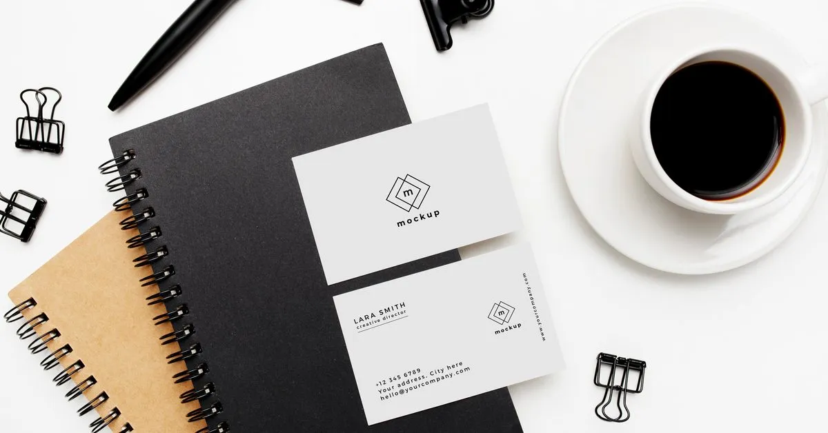
Yes, and often more than people expect. A business card is one of the few pieces of marketing a person physically takes with them. When it’s backed by a strong identity, it stops being contact information and becomes a reminder of who you are and why you stand out.
Physical pieces are also where weak logos get exposed. Paper doesn’t render gradients the way a screen does. Small print sizes punish fine detail. Ink colors shift if the palette was never specified properly. A logo built as an asset is tested for print, embroidery, signage, and packaging before it’s approved, not after the first order arrives looking wrong.
For List It Right, a consignment marketplace built to attract serious sellers, the identity needed to signal that the business was selective, professional, and trustworthy before anyone submitted a high-value item. Every design decision, from the mark itself to the business cards, was made to create a confident first impression that matched that positioning.
How Do You Build a Logo That Works as an Asset?
The sequence matters more than the software.
- Start with positioning. Define who you serve, what makes you different, and how you want to be perceived. The logo should express those decisions, not substitute for them.
- Study the context. Look at how competitors present themselves and where your brand needs to stand apart.
- Design for the smallest use first. If the mark works as a social avatar and a favicon, it will work on a billboard. The reverse isn’t true.
- Build a family, not a single file. A primary lockup, a stacked version, an icon, and approved one-color and reversed versions cover nearly every real use.
- Specify color and type precisely. Define colors for screen and print, and choose typefaces that support readability across channels.
- Test it in the real world. Put it on a phone screen, a printed card, a dark photo, a proposal cover. Fix what breaks before launch.
- Write the guidelines. Clear rules on spacing, sizing, color, and misuse let teams and vendors apply the brand correctly without slowing down.
A logo becomes valuable when it supports the larger business strategy behind the brand. That’s why the logo comes after the strategy, not before it.
When Should You Redesign Your Logo?
Redesign when the business has changed in ways the identity can’t express: new customers, new services, a new market position, or a merger. Also redesign when the mark has real functional problems that refinement can’t fix.
Don’t redesign because you’re bored with it, or because a competitor refreshed theirs. Recognition takes time to build. Every unnecessary change spends some of it.
Often the right move is a refinement: simplify the mark, tighten the palette, and create the guidelines that should have existed from the start. That protects the recognition you’ve earned while fixing what’s broken.
How Gridwell Approaches Logo and Identity Design
At Gridwell, logo design sits inside our Brand Strategy & Identity work. We start with positioning and audience, then design the mark, color palette, and typography as one system, and document it in brand guidelines your team and partners can actually use.
We design for durability, so the identity works across digital platforms, print, and physical spaces without constant redesign. For more on why strategy comes first, read Why Brand Strategy Is the First Growth System.
Frequently Asked Questions
What is the difference between a logo and a brand identity?
A logo is one mark. A brand identity is the full visual system around it: the logo and its variations, color palette, typography, imagery style, and the rules for using them. The logo is the most visible piece, but the identity is what makes a business look consistent across a website, a proposal, a vehicle, and a business card.
How do I know if my logo is working?
Check whether it’s recognized, whether it reads clearly at small sizes and in one color, and whether it signals the right position in your market. If customers confuse you with competitors, your team avoids using the logo in certain places, or multiple versions are in circulation, the logo isn’t working as hard as it should.
Should a small business invest in professional logo design?
If the business plans to grow, yes. A logo is used on nearly every customer touchpoint for years. Designing it with strategy behind it costs less over time than living with a mark that undermines trust, or paying to replace it once the business outgrows it. Simple, well-built marks often serve small businesses best.
What files should I receive when a logo is finished?
You should receive the primary logo and its variations, including stacked, icon, one-color, and reversed versions, in vector and web-ready formats. You should also receive exact color values for screen and print, the typefaces, and brand guidelines explaining spacing, sizing, and misuse, so anyone producing materials can apply the logo correctly.