A brochure website tells visitors who you are and stops there. A growth website does a different job: every page, call to action, and form is built to move a visitor toward a specific decision, and every inquiry lands somewhere a person will act on it. The difference is not how the site looks. It is whether the site was designed around what customers need to do next.
Too many businesses still treat their website like a digital brochure. It lists services, shows a few photos, and offers a contact page at the end of the menu. It exists. It just doesn’t contribute much to growth.
What Makes a Website a Brochure?
A brochure site is organized around the company. A growth site is organized around the customer’s decision.
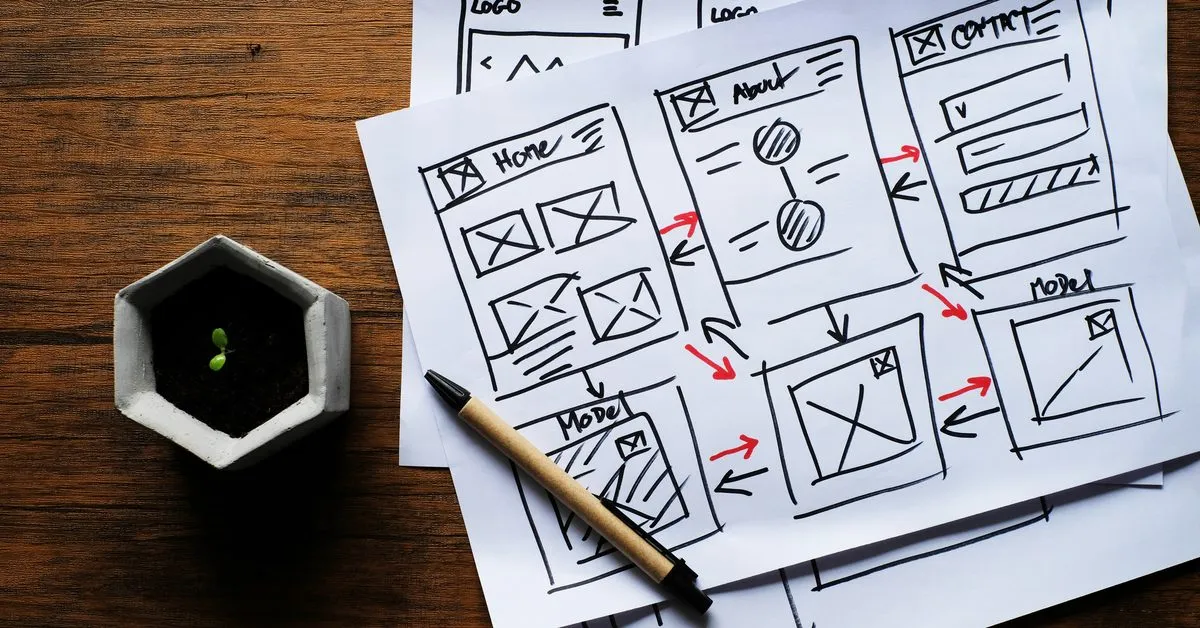
You can usually tell which one you have by looking at the structure. Brochure sites follow the org chart: About, Services, Team, Contact. Each page describes something, and none of them asks the visitor to do anything. The only path to a conversation is a contact form that sends an email to a shared inbox.
The highest-performing websites are designed with a purpose. They answer the visitor’s question, prove the business can solve the problem, and make the next step obvious. A website should do more than exist. It should contribute to growth.
Warning Signs Your Website Is Working Like a Brochure
- Your pages have no clear next step. Visitors read, then leave, because nothing tells them what to do.
- Every call to action says “Contact Us.” One generic ask can’t serve a first-time visitor and a ready-to-buy prospect at the same time.
- Your homepage tries to say everything. When every service gets equal weight, nothing stands out.
- Forms go to an inbox, not a system. Inquiries wait until someone notices them, and some never get answered.
- You can’t say which pages produce leads. Without tracking, the site is a cost you can’t evaluate.
- The site hasn’t changed since launch. A growth website gets better as you learn what visitors do. A brochure stays frozen.
If three or more of these sound familiar, the site is describing your business instead of growing it.
What Should Each Page on Your Website Do?
Every page should have one primary job, and you should be able to say it in a sentence.
- The homepage routes visitors. It says what you do, who it’s for, and why you’re different, then sends each type of visitor to the page built for them.
- Service pages answer the questions a buyer asks before they reach out: what’s included, who it’s for, what the process looks like, and what makes your approach different. They end with a clear next step.
- Proof pages, such as case studies, reviews, and testimonials, reduce risk. They show the visitor that people like them got the result they want.
- Location and industry pages meet visitors where they search. A buyer looking for help in their city or their industry should land on a page that speaks to it directly.
- The contact or booking page removes friction. It explains what happens after someone reaches out and asks only for what you need.
When a page can’t name its job, it usually ends up repeating another page or saying nothing that helps a buyer decide.
How Should Calls to Action Work?
Calls to action should match where the visitor is in their decision.
A first-time visitor who is still learning won’t book a call, but they might take a free audit, read a guide, or subscribe to a newsletter. A visitor comparing options wants a case study or a clear look at your process. A visitor who is ready wants the fastest path to a conversation.
Good sites offer each of those steps and make one of them the primary action on every page. They use specific language, such as “Book a discovery call” or “Get a free website audit,” instead of “Learn more” or “Submit.” And they repeat the primary action where it is needed, at the top of the page and again after the visitor has read enough to decide.
Why Do Website Forms Lose Leads?
Most forms fail for one of two reasons: they ask for too much, or the inquiry goes nowhere useful.
Long forms create friction before trust exists. Ask only for what you need to respond well, and save the rest for the conversation.
The bigger problem is what happens after someone clicks submit. If the form sends an email, the lead depends on someone seeing it, forwarding it, and remembering to follow up. That is where a lot of website leads disappear.
A growth website connects every form to a CRM. The inquiry is captured with its source, routed to the right person, and answered with an automatic confirmation right away. Follow-up is tracked, so nothing sits in an inbox and leadership can see which pages and campaigns produce real opportunities.
How Do You Turn a Brochure Site Into a Growth Website?
You rarely need to start over. Start with structure and measurement, then improve page by page.
- Define the decisions. List the actions you want visitors to take, from subscribing to booking a call, and rank them.
- Map the visitor types. Who comes to the site, what are they trying to figure out, and which page should answer it?
- Give every page one job. Rewrite or merge pages that can’t name their purpose.
- Match calls to action to readiness. Offer a low-commitment step and a ready-to-talk step, with one primary action per page.
- Shorten the forms. Ask for what you need to respond, nothing more.
- Connect forms to your CRM. Capture the source, route the lead, and send an immediate confirmation.
- Track what matters. Set up conversion tracking so you can see which pages and channels produce leads, not just traffic.
- Review and refine. Look at what visitors do, test changes to the pages that matter most, and keep improving.
How Gridwell Approaches Websites
Gridwell builds websites as part of our Creative & Experience Design service, and we start with the customer’s decision, not the layout. We map who visits, what they need to know, and what we want them to do next, then design the pages, calls to action, and forms around that path. Every site we build connects to the CRM, so inquiries are captured, routed, and answered.
If you aren’t sure whether your site is helping or hurting, our free website audit looks at performance, search visibility, and how inquiries are captured. For the design side of the same question, read Why Experience Design Determines Whether Growth Converts.
A website should do more than exist. It should move people to act.
Frequently Asked Questions
What is the difference between a brochure website and a lead generation website?
A brochure website describes the business: services, team, and contact details. A lead generation website is built around the visitor’s decision. Each page has a clear job, calls to action match how ready the visitor is, forms connect to a CRM, and tracking shows which pages produce inquiries. The second kind is measured by the leads it creates, not by how it looks.
How many calls to action should a page have?
One primary action per page, supported by a secondary option for visitors who aren’t ready yet. For example, a service page might lead with booking a discovery call and offer a free audit as the lower-commitment step. Repeat the primary action where the visitor is most likely to decide, near the top and again after the key information.
Why should website forms connect to a CRM?
When a form only sends an email, every lead depends on someone noticing it and remembering to follow up. A CRM captures the inquiry with its source, routes it to the right person, sends an immediate confirmation, and tracks follow-up. That protects leads you already paid to attract and shows which pages and campaigns actually produce business.
Do I need a new website to fix these problems?
Usually not. Many brochure sites can be improved by clarifying each page’s purpose, rewriting calls to action, shortening forms, connecting them to a CRM, and adding conversion tracking. A rebuild makes sense when the platform is slow, hard to update, or can’t support the structure the business needs. Start with an audit before deciding.