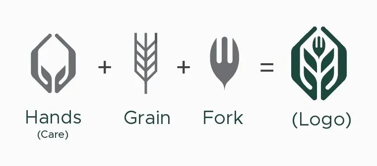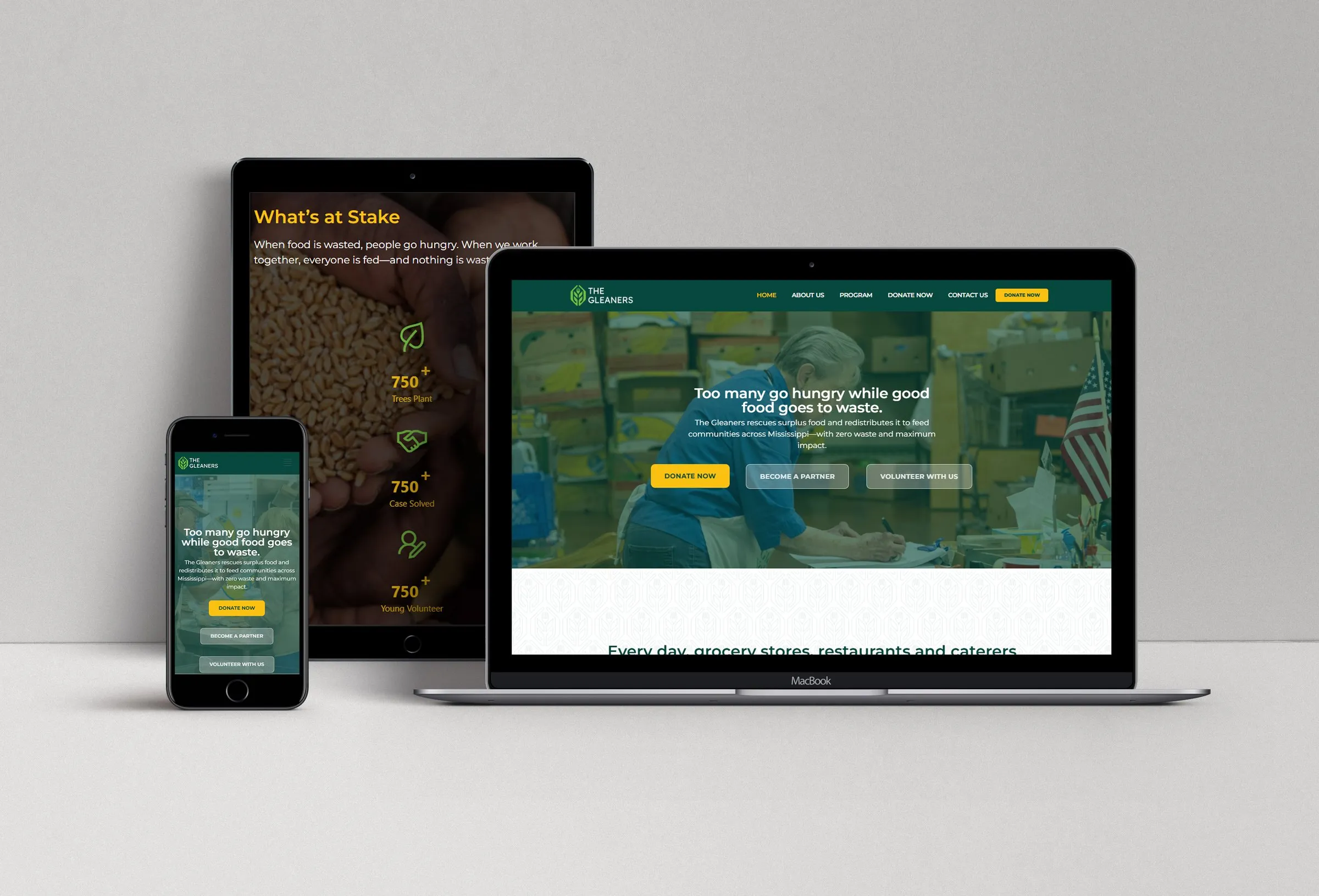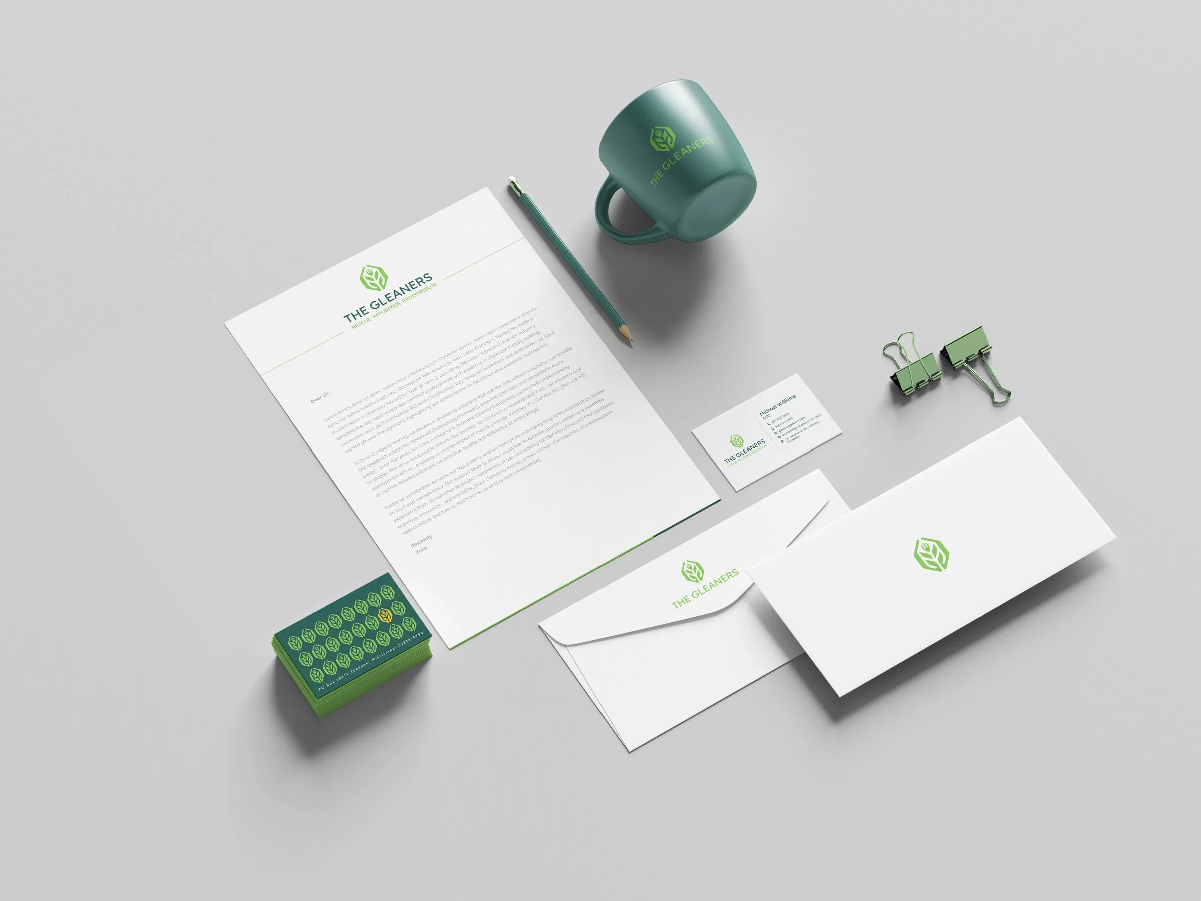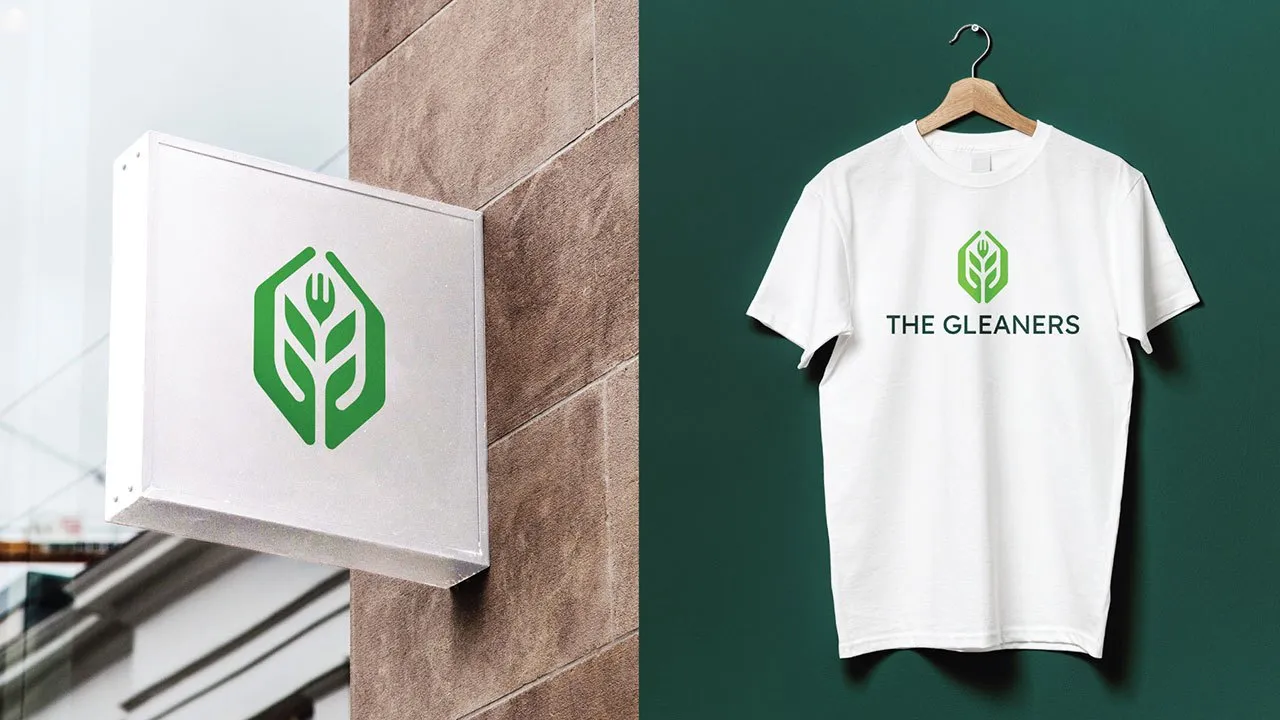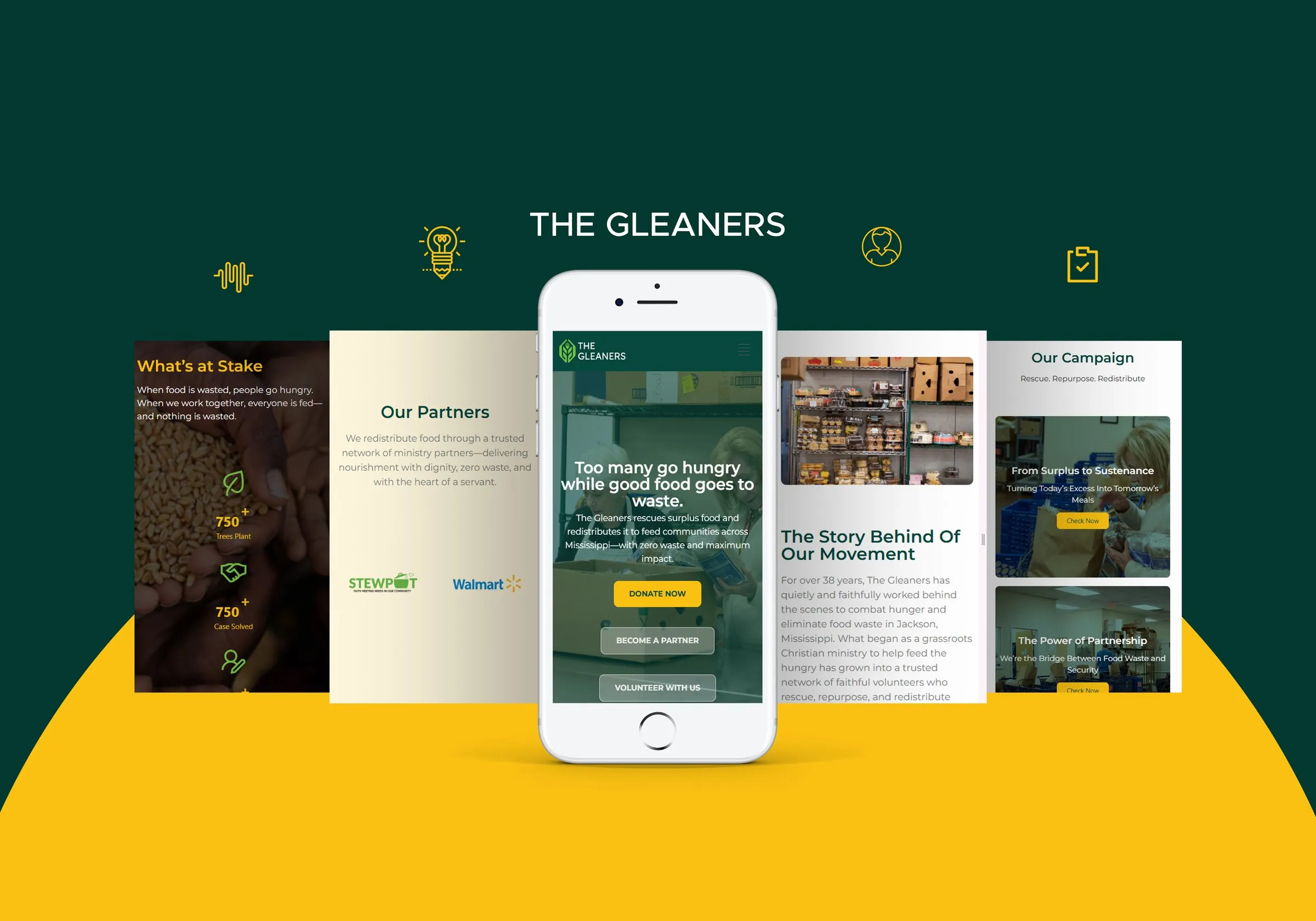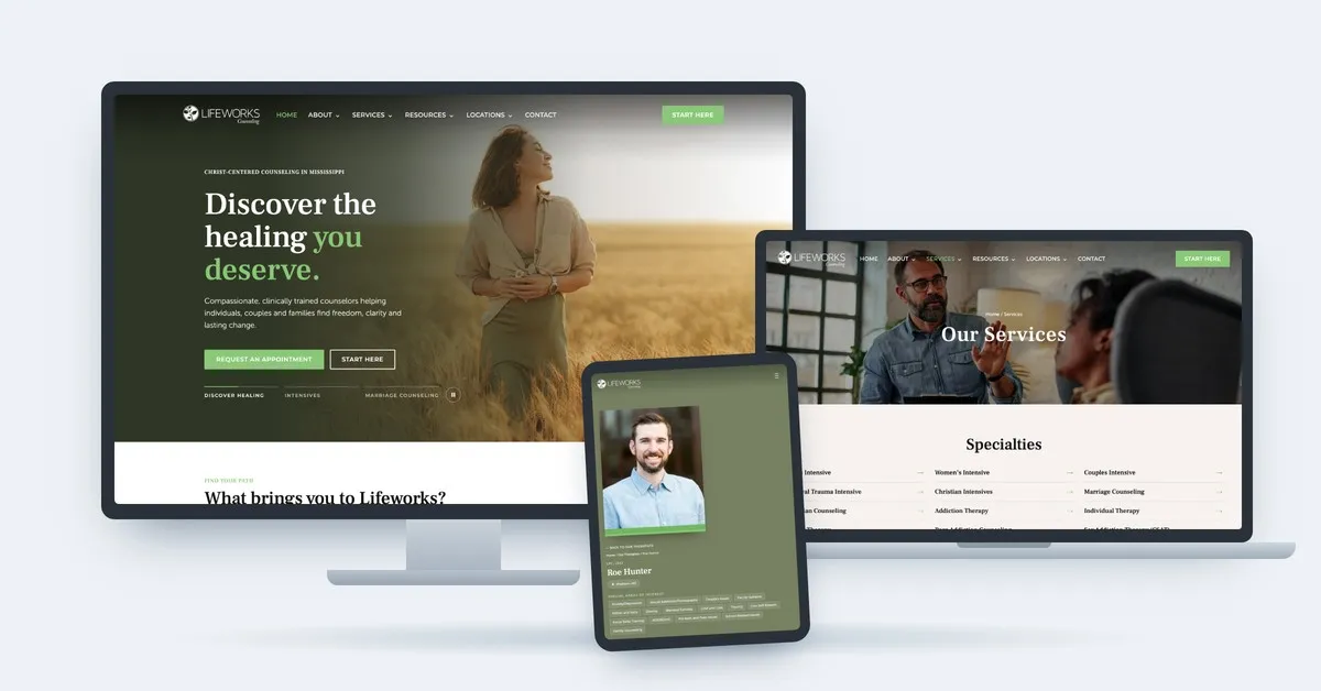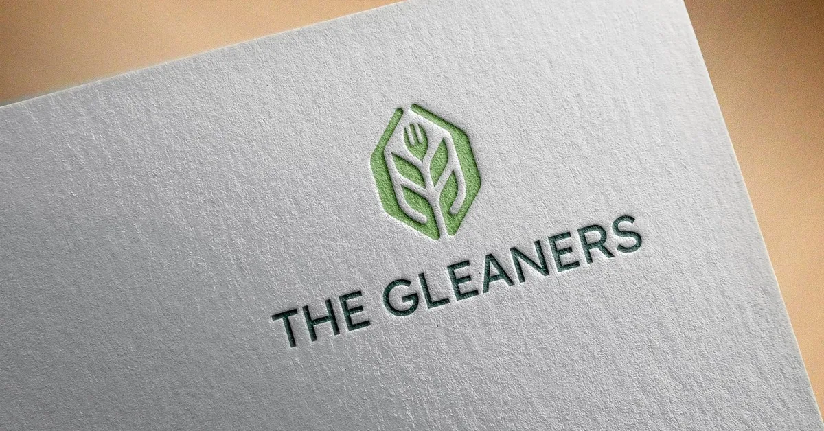


Gridwell partnered with The Gleaners to deliver a full strategic and creative transformation, including a comprehensive SWOT analysis, brand messaging and positioning, logo design, branding guidelines, website design, donor strategy, infographic design, and vehicle graphics. The goal was not just to refresh their look, but to clarify their identity, sharpen their story, and equip them for long-term growth.
The Problem
Despite their deep impact and strong reputation, The Gleaners faced two major challenges: an aging donor base and a brand identity that felt dated and misunderstood—particularly by younger audiences. Their existing visual identity was rooted in historic imagery that no longer reflected who they were or how they operated. Internally, their unique strengths were under-articulated, making it difficult for donors, partners, and the broader community to fully understand what set The Gleaners apart from traditional food banks.
The Solution
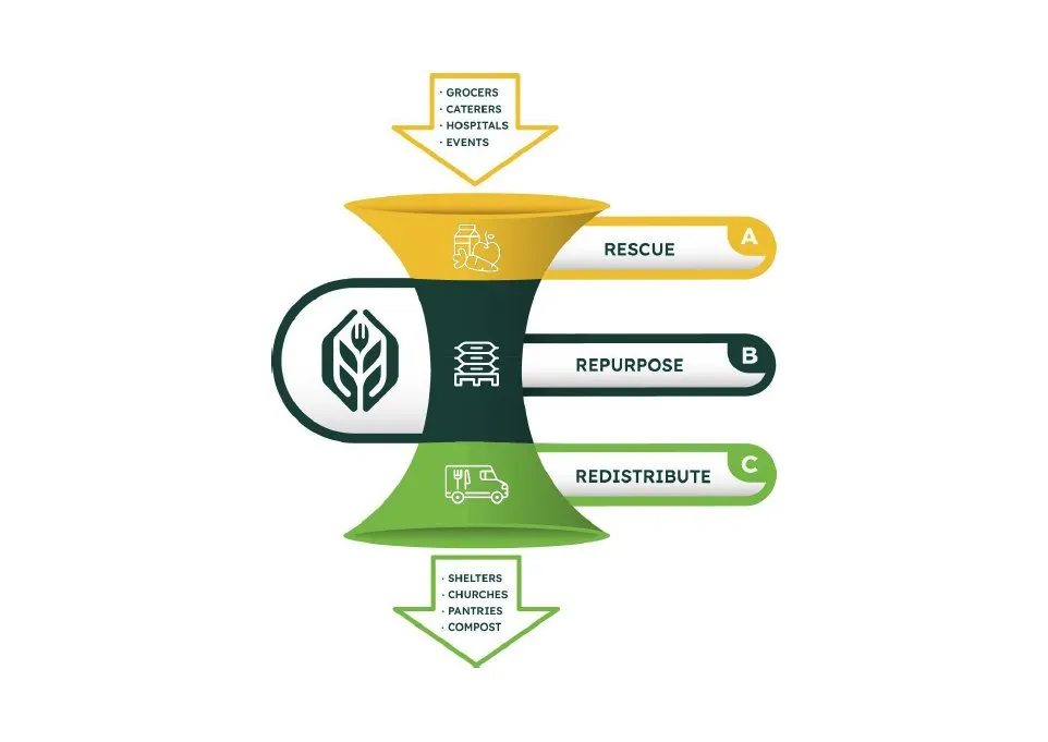
Gridwell helped The Gleaners clarify and confidently communicate their true value. Through strategic discovery, we reframed their work around a simple, powerful message—Rescue. Repurpose. Redistribute. In doing so, The Gleaners gained a new understanding of their greatest differentiator: their ability to repurpose rescued food through refrigerated trucks, industrial coolers, and safe handling processes that dramatically extend food viability and feed more people.
This insight informed a new brand story, modern logo, cohesive visual identity, and a clear donor strategy designed to engage a new generation of supporters. The result is a revitalized brand that honors nearly 40 years of faithful service while positioning The Gleaners for sustainable growth in the years ahead.